Topics on This Page
Clusters
Clusters are a class of unsupervised machine learning algorithms used for classification of data points. They help users understand the natural grouping or structure in a dataset.
Clusters group data points based on the chosen algorithm. Objects in the same group (cluster) are more similar (in some sense or another) to each other than to those in other groups.
Create a Cluster
- Create a chart. Tips:
- Clusters are best suited for scatter, bubble, and point charts using color, shape, or trellis in Chart Builder.
- Trellising clusters in other types of charts can also be useful.
- Maps are not supported.
- You can create only one cluster group in a chart.
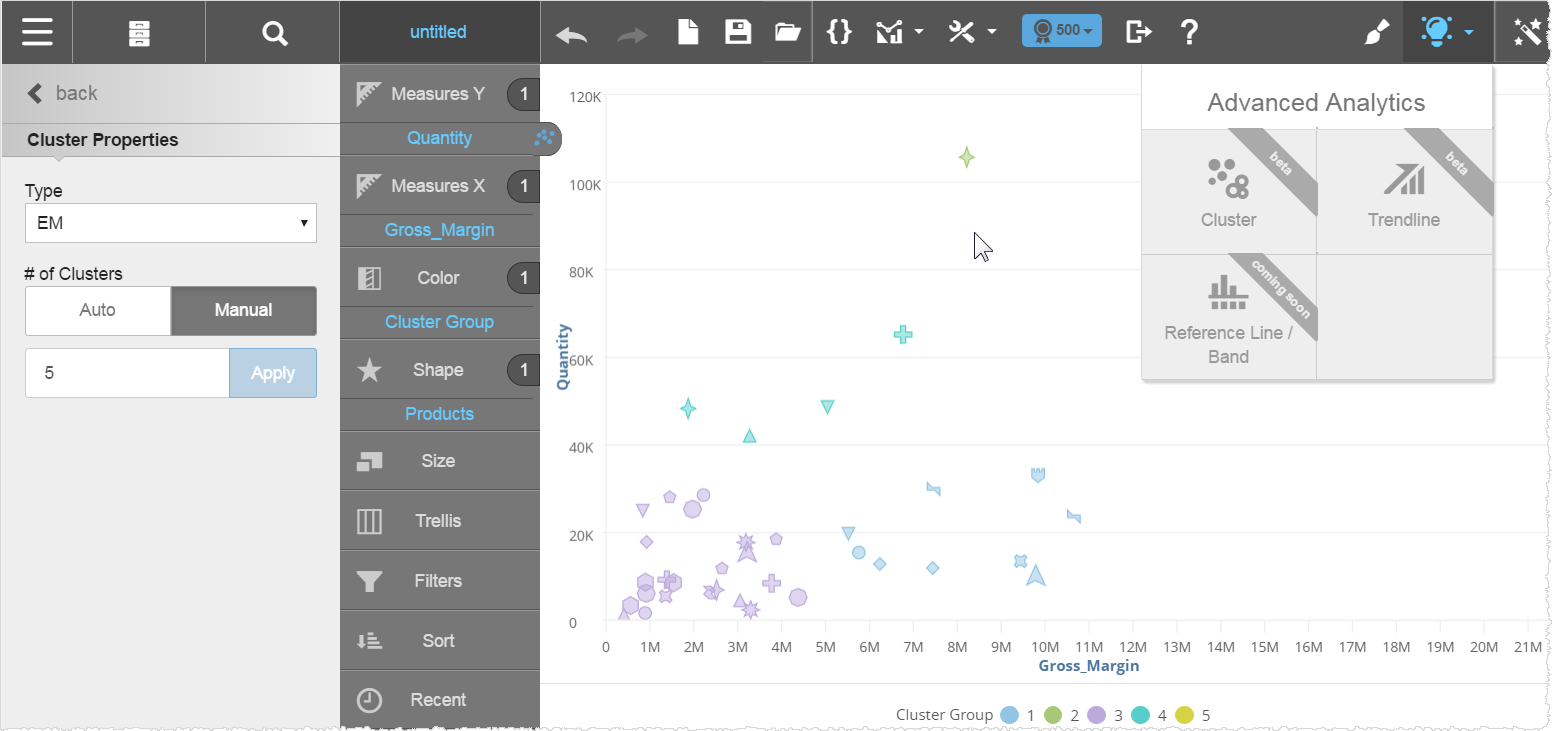
- From the Advanced Analytics menu, select Cluster to open the Cluster Properties panel. Visualizer adds Cluster Group to the Chart Builder and displays the clusters.
- Select the algorithm. Expectation Maximization (EM) is the default, but k-means is also available.
- Select the Number of Clusters. You can specify the number of clusters in manual mode or let the algorithm select it automatically, based on the dataset.
- Click Back to close the panel.
Trendlines
Trendlines identify an increasing or decreasing trend in the dataset. You can add an attribute to a color, shape, or trellis in Chart Builder for a report containing a trendline.
Trendlines are a class of supervised machine learning algorithms used for regression analysis. They identify the relationship among the data that helps predict future Y-values given the X-values.
Create a Trendline
- Create a chart.Tips:
- Use an area, areaspline, bar, column, line, or spline chart.
- You can use only one trendline in a chart.
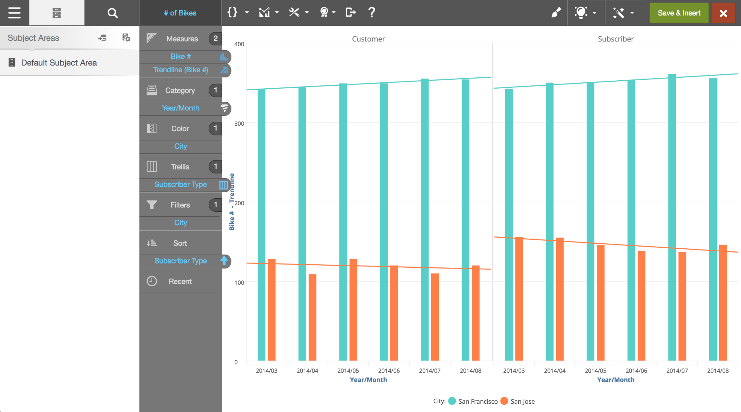
- From the Advanced Analytics menu, select Trendline to open the Trendline Properties panel.
- Select the Type.
- Select the Measure against which you want to plot the trend. Visualizer adds the trendline measure to Chart Builder and plots the trendline on the chart.
- Click Back to close the panel.
Benchmarks
Benchmarks provide a reference across the attributes of a measure via a line or band display. A benchmark can be the mean, minimum, maximum, median, or a constant of the measure value. A band is a range between two benchmark lines.
Create a Benchmark
- Create a chart with a measure and an attribute.Tips:
- Use a bar, column, line, or spline chart.
- Adding an attribute to a color, shape, or trellis in Chart Builder will remove the benchmark.
- You can use only one benchmark (line or band) in a chart.
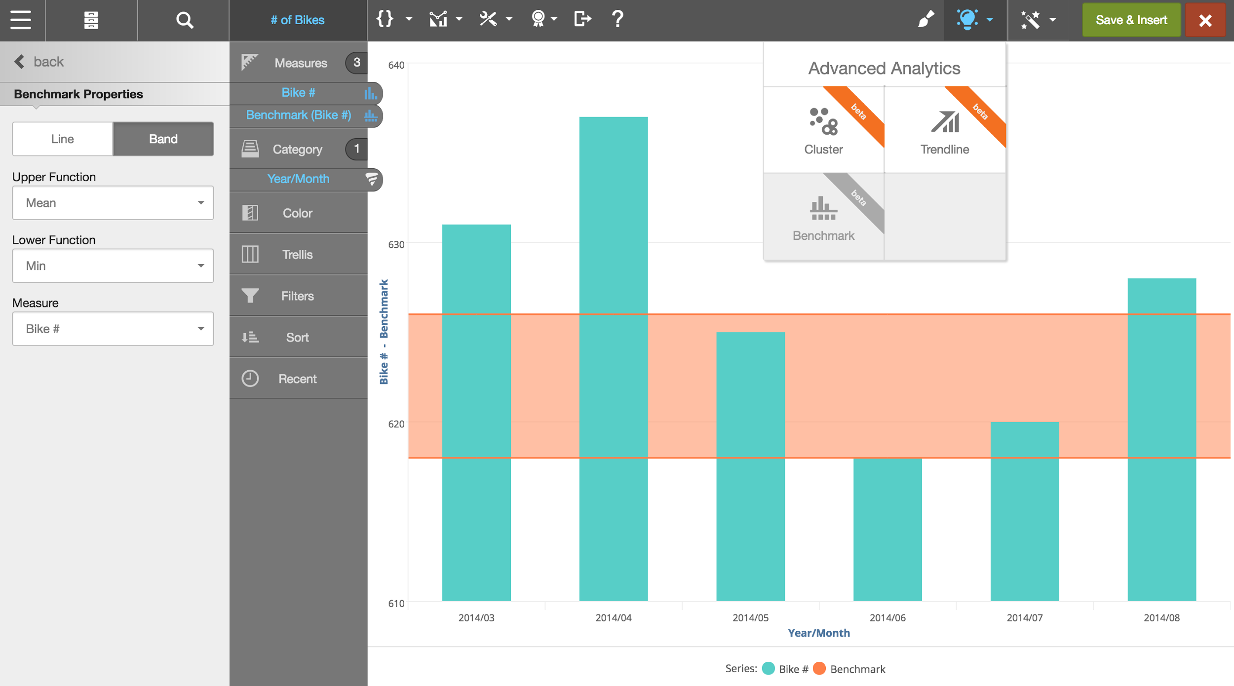
- From the Advanced Analytics menu, select Benchmark to open the Benchmark Properties panel. Visualizer adds the line or band to Chart Builder and plots a mean line on the chart.
- Click Band to add an optional band.
- Select the Function or Upper Function that is calculated for the measure. Visualizer plots a line on the chart. The following functions are available:
- Mean—sum of all values divided by the count of rows
- Min—smallest value in the set
- Max—largest value in the set
- Median—middle value in the set, where half are lower and half are larger
- Constant—you enter a fixed number
- If using a band, select the Lower Function. Visualizer plots the line or band on the chart.
- Optionally, select a different measure.
- Click Back to close the panel.